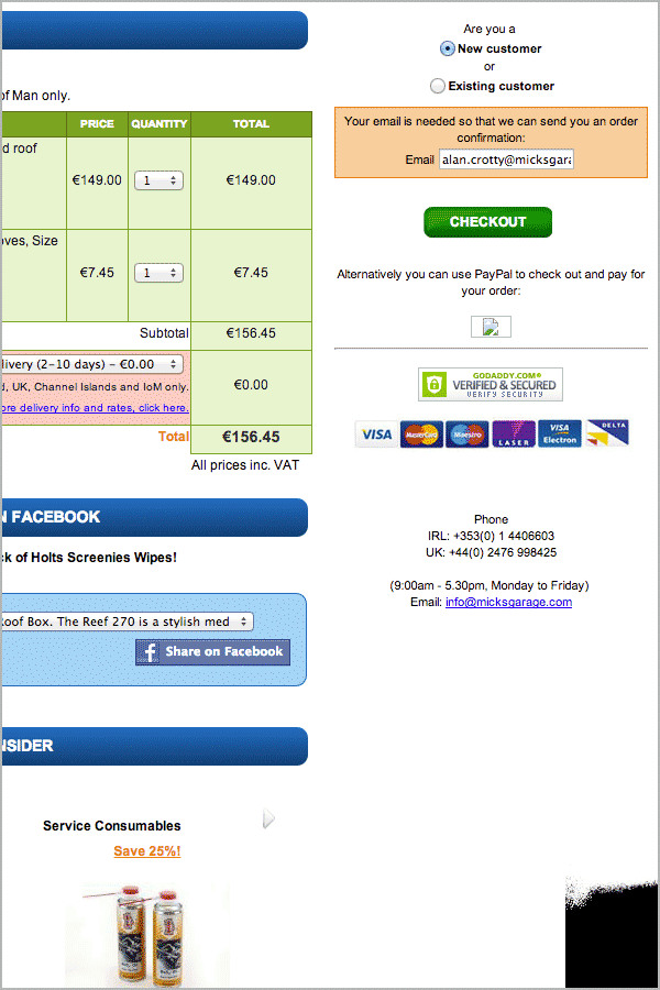
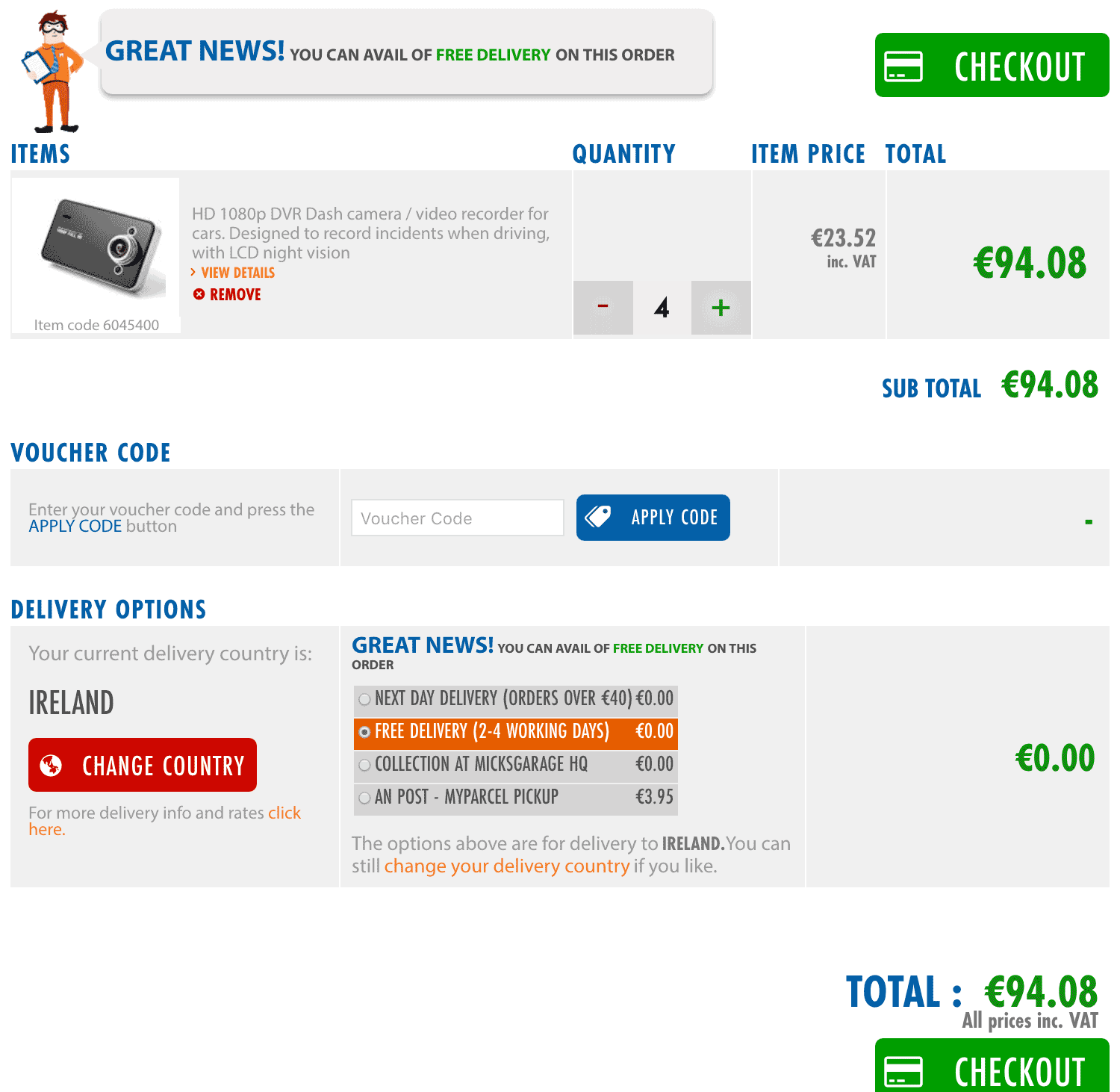
The first UX project I took on for MicksGarage was to look at the basket pages, the checkout process and the accounts section. As these areas were all closely linked I looked at it as one project. Analytics showed that we were loosing an unacceptably large percentage of customers at the basket page so this was the first page to tackle. However, fixing some simple UI / usability issues on the basket page highlighted problems further down the purchase funnel - primarily the checkout process itself and the accounts section.
Analytics clearly showed that customers were being turned back at this point by unnecessary complexity, I sought to clarify the relevant elements of the layout and provide a clear path to completion of purchases.
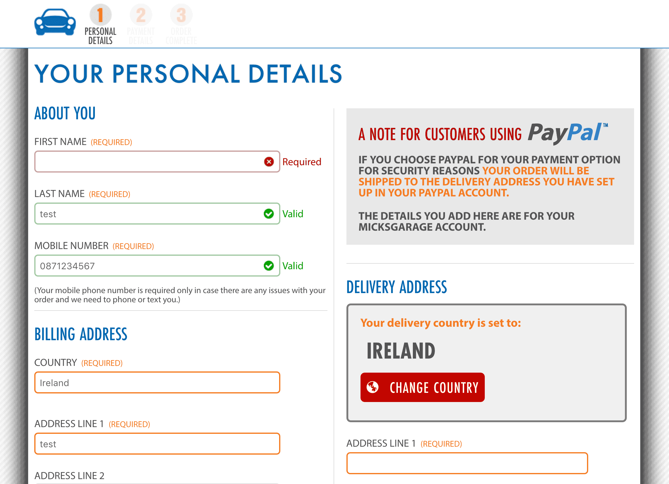
The existing basket page endeavoured to contain the entire checkout process in a single step. This resulted in one overly complicated single page which I replaced with a short process involving four simple steps followed by a confirmation page.
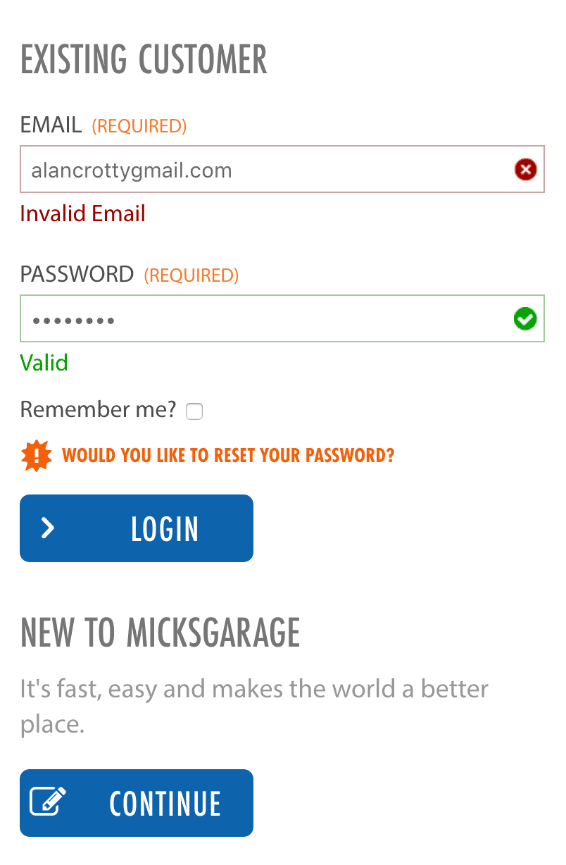
The form validation throughout these pages was very successful. Inspired by Luke Wroblewski we opted for realtime validation of user input which analytics and observation showed was very successful. Over time a good record of customers behaviour was collected and the hinting system was modified to maximise successful interaction with these pages.